



The logo sits neatly above the name. The contact details align. On screen, the business card looks finished—but the client still has to imagine the paper, the weight, and the way light catches its surface.
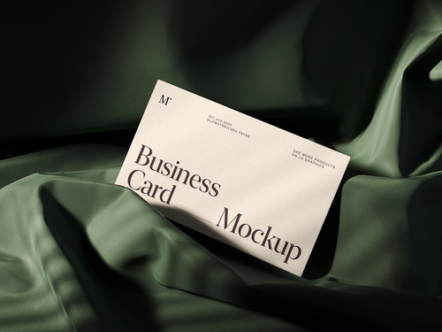
A business card mockup fills in those gaps. Within a brand identity presentation, it also answers a larger question: does this small printed object belong to the same brand as everything around it?
Start With the Brand Identity
Choose the mood before choosing the scene. The same card composition can feel entirely different depending on its typography, materials, and surroundings:
- Quiet luxury: generous spacing, restrained type, and muted colors. Uncluttered scenes and soft light give paper and subtle finishes room to speak.
- Energetic creative studio: bold colors, expressive typography, and playful graphics. Dynamic compositions suit the identity, provided contact details stay readable.
- Established professional firm: precise grids, clear hierarchy, and a controlled palette. Straightforward front-and-back views reinforce clarity and reliability.
- Independent craft brand: warm colors, tactile materials, and illustration or lettering. Paper textures and simple surroundings support its hands-on character.
- Modern technology company: crisp type, modular layouts, and distinctive color accents. Clean backgrounds and sharp alignment connect print to digital applications.
Carry the approved logo proportions, typography, colors, graphic elements, and tone of voice onto both sides. Let the connections show: the contact grid might echo the website; a color block might reappear on packaging.
The card is a small-scale test of the identity. Choose scenes that reveal those relationships, and it will feel like a natural part of the brand.
Prepare the Business Card Design
A beautiful scene can make an unfinished layout look convincing. Give the artwork its own review first:
- Card dimensions: confirm the finished size with the printer and select a matching mockup. US and European formats can have different proportions.
- Bleed and safe margins: follow the printer’s specifications and keep essential content away from trim edges.
- Readable typography: inspect names, job titles, and contact details at actual size.
- Logo proportions: preserve the original aspect ratio and required clear space.
- Spacing and alignment: review margins, line spacing, and text blocks.
- Front-and-back consistency: check colors, typography, and hierarchy across both sides.
- Contact information: proofread every detail and test QR codes at their intended printed size.
- Production artwork: check image quality, fonts, color settings, and finishing layers against the printer’s requirements.
Keep print-ready files separate from presentation exports. Unless the template specifies otherwise, place trimmed artwork in the mockup. A polished preview supports design approval; production checks still need their own attention.
Choose Realistic Business Card Mockups
Give every image a job. Four useful scene types cover different questions:
- Flat-lay: can the client read the typography and compare both sides?
- Stacked cards: are the edges and intended paper thickness visible?
- Angled views: does the presentation have a strong hero image?
- Close-ups: can the client see the texture, logo details, or print finish?
When choosing a card business mockup, match its format and mood to the project. Two or three coordinated views usually offer enough variety. Each should earn its place by revealing something new.
In the clearest view, show both sides together. Place cards side by side or overlap them without covering contact information. Keep their scale consistent. Save the dramatic perspective for the hero image.
Make Paper and Print Finishes Believable
Start with the stock. Smooth matte paper and textured stock create different impressions, even when the artwork stays identical. Keep grain subtle around small type, and avoid chunky edges if the proposed card is thin.
Then look at the light. Contact shadows should anchor the cards to the surface. Embossing should rise from the paper; debossing should sink into it. Their highlights and shadows need to follow the scene’s lighting.
Foil needs reflection, not just a gold fill. Choose a template designed for that treatment and apply it only to the artwork intended for finishing.
Label unconfirmed materials as proposals. The mockup shows the expected appearance; a physical print proof lets you judge the actual paper, color, and finish.
Build a Clear Business Card Presentation Sequence
Let the client understand the idea before asking them to inspect the details:
- Brand overview: introduce the logo, palette, typography, and connecting idea.
- Front and back: show clean layouts with both sides readable.
- Hero mockup: present the card as a finished object.
- Material detail: highlight a meaningful paper or finishing decision.
- Wider applications: connect the card to letterhead, envelopes, packaging, or other relevant branded materials.
Captions should explain choices. “The contact grid follows the letterhead alignment” gives the client something to assess. “Premium stationery design” gives them little to work with.
Close with specific decisions: layout, stock, or finish. Keep design approval distinct from production approval.
Keep the Scenes and Workflow Consistent
Think of the mockups as a single shoot. Coordinate backgrounds, paper tones, lighting direction, shadow softness, and composition density. Camera angles can change without breaking that shared atmosphere.
On ls.graphics, you can choose between two workflows: an easy-to-use browser mockup generator with an extensive collection of static and animated mockups, or downloadable PSD, Figma, and Sketch files for working in your preferred design environment. Check the available formats for each resource before choosing a scene.
Before exporting, clear away distracting props. Look for stretched logos, exaggerated thickness, hidden reverse sides, and text shown only at a steep angle. Review the final presentation at the size the client will see.
FAQ
How Can I Show a Client What Both Sides of Their Business Card Will Look Like Before Printing?
Pair a front-and-back mockup with a clean flat view for checking information. Ask for layout feedback separately from feedback on the material proposal so approvals stay clear.
Where Can I Find Business Card Mockups With Realistic Paper Textures, Visible Thickness, and Editable Card Colors?
Browse specialist mockup libraries for close-up previews and clear layer descriptions. Check which elements are editable: realistic paper in a preview does not guarantee separate texture, edge, or color controls.
What Are the Best Resources for Embossed, Debossed, and Foil-Stamped Business Card Mockups?
Prioritize templates showing the intended finish on artwork similar to yours. Inspect fine lettering and solid areas, then check whether a separate mask or artwork layer controls the effect.
Where Can I Download High-Resolution Business Card Mockups That Keep Small Text and Logos Sharp in Client Presentations?
Choose resources that disclose source dimensions and show enlarged previews. Test the export at your final slide size: even a large image can leave the card occupying too few pixels for readable text.
Present a Coherent Brand System
A professional business card presentation makes the design, material, and scene feel like parts of one identity. Show both sides at believable proportions. Bring the material details into view. Connect the card to the wider brand, then guide the client through the decisions that need to happen before printing.
